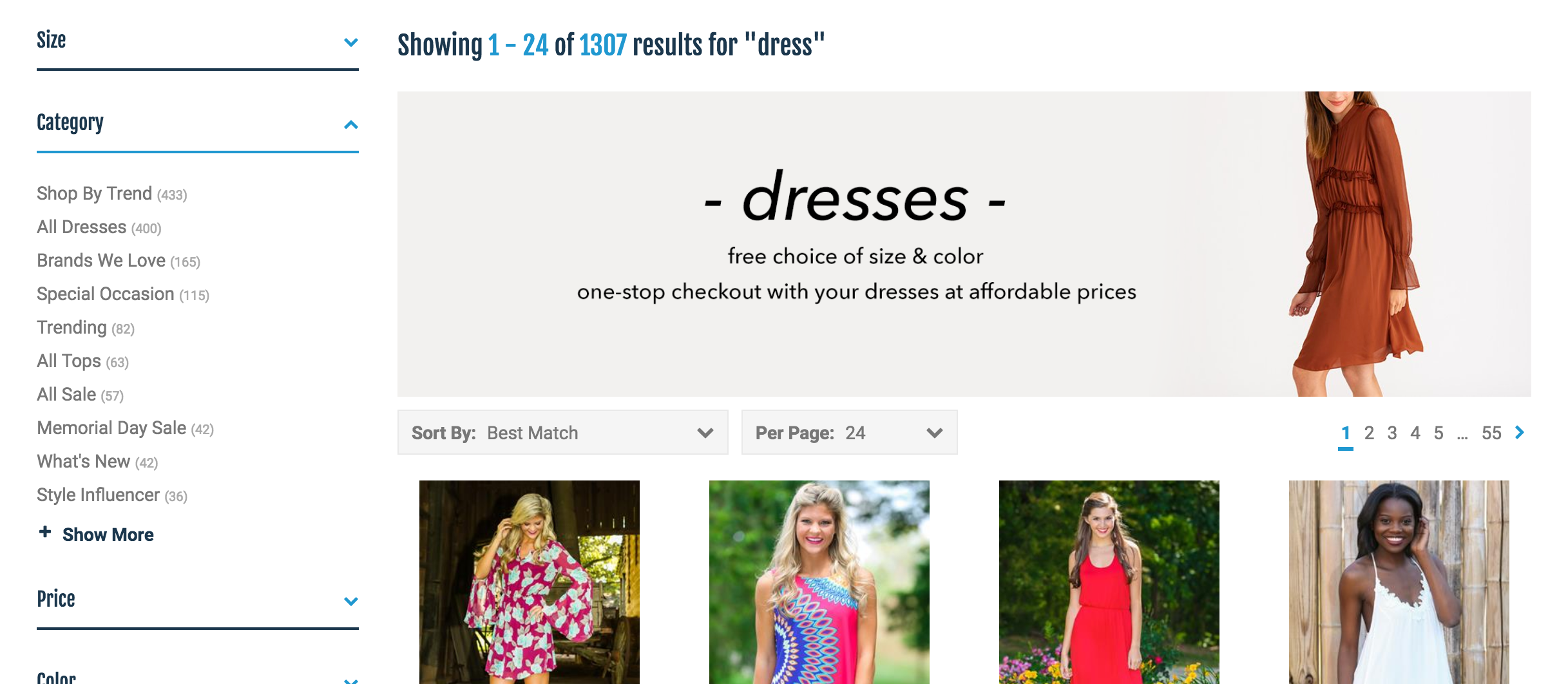
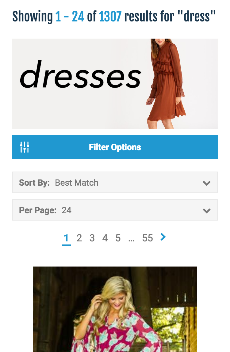
If you would like a different image to show up on mobile vs. desktop devices for your shoppers, copy the code below and use it in an HTML banner in Visual Merchandising.
Be sure to change the min-width value to the screen width that you would like the mobile image to start showing up, and fill out the image URLs to the web addresses of your images.
<style>
.mobile-banner, .desktop-banner {max-width: 100%;}
.mobile-banner {display: block;}
.desktop-banner {display: none;}
@media only screen and (min-width: 760px) {
    .mobile-banner {display: none;}
    .desktop-banner {display: block;}
}
</style>

<img class="mobile-banner" src="IMGURL.JPG"/>
<img class="desktop-banner" src="IMGURL.JPG"/>

Comments
0 comments
Article is closed for comments.